Dev Log
Our Longest Days is a project started with the theme of realism. It's a combination of each of our own prototypes that evolved into its own unique form.
The prototype version of the game was a clear and straight forward indication of the game's mechanics. We made the decision of using NavMesh function for the player control compare to the pressing keys to move. The placement of our camera was the main reason that leads us to use NavMesh. During the early discussion, we made an agreement of making a simulation game about the current pandemic situation. We wanted the game to deliver our thoughts on how the quarantine affected us on both physical and mental health. And we wanted to use the visual of the game to strengthen the point of being isolated. We set the camera on a top-down view that it allows the player to see how big the play space and how tall the walls are. We hope that it could inform our player about the limited space at the moment the started the game. The camera position helped us to change the game into a 2-D game, and allow us the try something different for the controls.
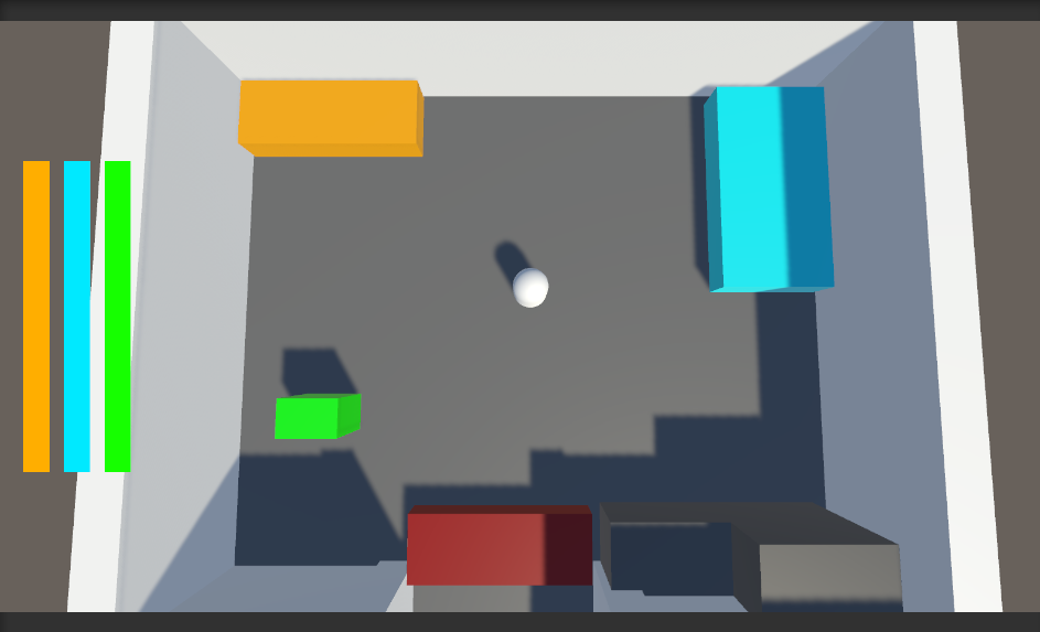
Besides the control, the prototype version also included the early version of the UI that represents three stats that the player need to pay attention on during their play through. We use cube objects as the place holders for the essential objects in the room and colored them with the same color of the UI bars so it would be easier to tell the connection between the cubes and the UI elements.
At this version, the yellow bar will start to decrease through the time once the game start. Moving the player object towards the yellow cube will refill the yellow bar. Refilling the yellow bar will cause the green bar to drop, and refilling the green bar will cause a deduction in the blue bar. We wanted to use this simple mechanic to showcase the cycle of our game, players will have to experience this cycle continuously throughout their play through and experience the anxious feeling of never able to keep all three bars filled at the same time. Overall, we believe that it is a successful prototype.

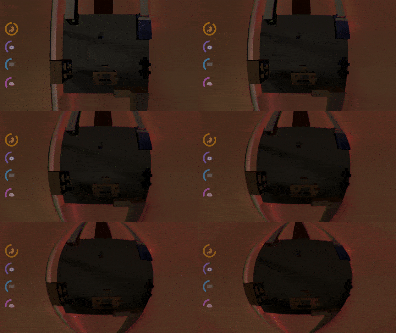
During the early play testing, one of the first feedbacks we got was that the change between the dark mode and the distortion effect was too harsh. In order to make it feel more gradual, we decided to map the lightings and the distortion effects to the mental health value so that the room slowly becomes dark when the mental health is getting low.

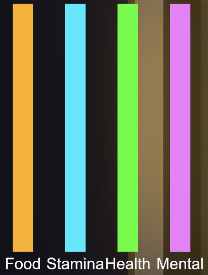
Another thing we changed a lot through out the process is the UI system. At the beginning, we had four bars with text under them to represent player stats. During the development process, especially after adding the post processing effects, we realized that the bars were too jaring to look at and also taking up too much screen space. Therefore, we decided to change the bars into rings surrounding an icon. Then in the play testing session we got the feedback that the icons feel too positive and cartoony that it doesn't feel cohesive with the scene. We replaced the traditional cartoon icons and replaced them with icons of organs and things inside the scene to make the UI system feel more neutral. In the end, we also mapped the opacity of the UI to the mental health value so that when enter the dark mode they won't be disturbing the experience.
In addition to the visual changes, we also tweak the UI system itself. In the early prototypes, we had the four bars representing food, stamina, physical health and mental health. During the play test, we got a feedback saying the bars feel too similar and too linked. As a result, we decided to change the bars into food, rest, entertainment and mental health to create more differentiation between them. We've also changed the value changes when interact with objects. Initially, there was no way to increase the mental health value and it's always decreasing. Although our concept is that no matter what the player does, the mental health value will eventually go down to zero, we realized that it would be highly possible that the player loses interest in the game real quick and stop trying after they realize there's no way to regain the mental health value. Therefore we made a few objects able to slightly increase the mental health value so that players would still try to survive in the middle part of the game.
 |  |  |  |
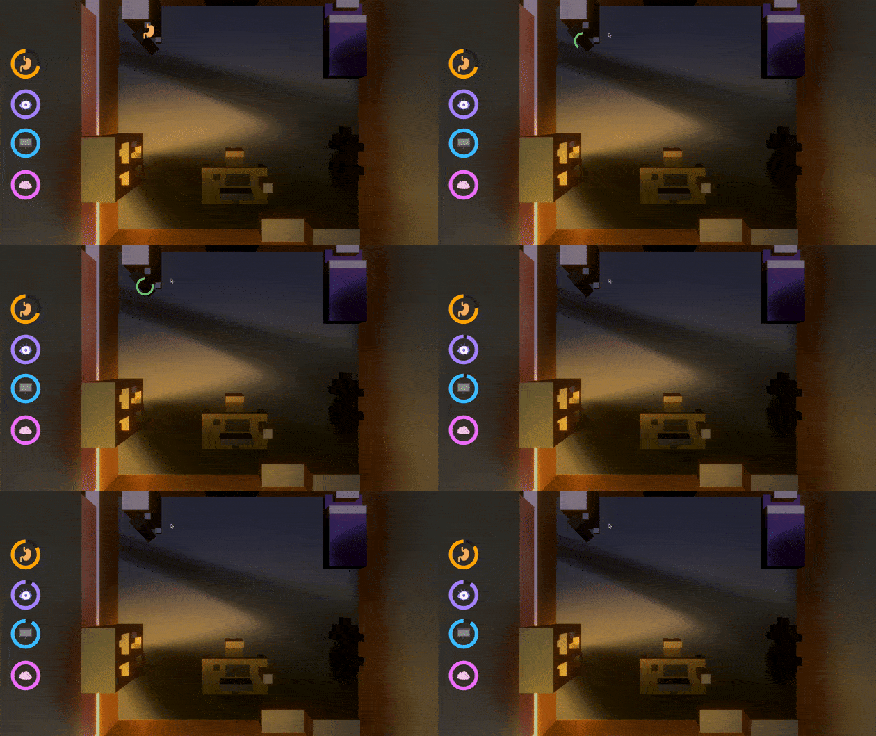
Mechanic wise we changed the way that the stat value change. In the earlier prototypes, to interact with an object, the player just need to collide with it and the value goes up instantly. We felt that it would make the game feel more unreal, which is not our goal, so we created a cool down ring displaying the amount of time the player has spent in a certain place and once the ring disappears the value will gradually go up.

Get Our Longest Days
Our Longest Days
A look into daily life during a global pandemic
| Status | Released |
| Authors | fungifurball, Consc, KorvuZ |
| Genre | Simulation |
| Tags | Life Simulation, Management |

Leave a comment
Log in with itch.io to leave a comment.